Made, Not Generated: A Website Design Crash Course
15 Concepts · Your First Real Build
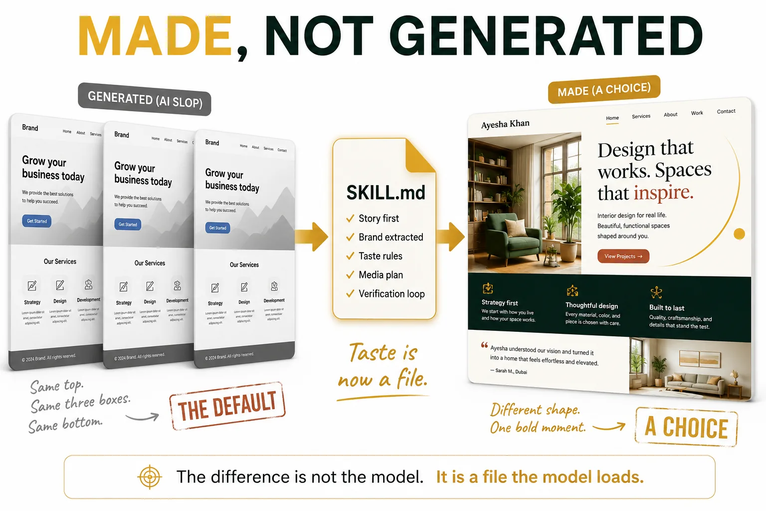
The site on the right belongs to an interior designer. It is here only to show the contrast. The client you and I build for later in this course is a different person: Ayesha Rehman, an accountant in Lahore.
Ask an AI to build you a website. You will get one. It will load. It will scroll. And it will look like every other AI website ever made.
You have seen this website many times. A big picture at the top. A large sentence in the middle. Three small boxes in a row. A colorful button. A headline that says something like "Revolutionize your workflow."
Most AI websites look like this. They are not broken. They are something worse. They are all the same.
There is a word for the difference, and it is the name of this course. Some websites are made. Most are only generated. A generated website is what the computer gives you when nobody guides it. A made website is one where somebody made real choices.
This course teaches you to build the made ones.
You do not need to be a designer. You do not need to write code by hand. You need the tools from the Agentic Coding Crash Course, plus the ideas on this page. By the end you will have built a real website: with a story, real photos, a version that works on phones, and a web address anyone in the world can open.
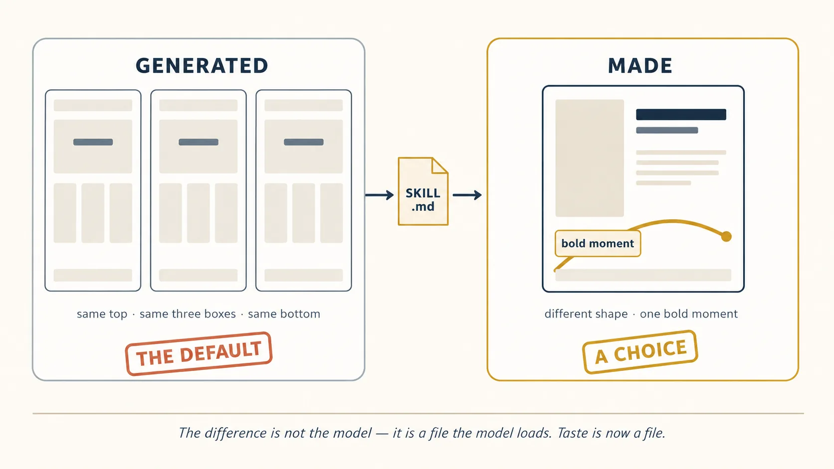
Here is the one idea that makes the rest of this course easy to understand. Good design used to live inside expensive tools or inside talented people. It does not anymore. The rules that separate "made" from "generated" can be written down in a file. Any AI can read that file and follow those rules.
So, in one line, this is what the course is about:
Taste is now a file.
Taste means knowing what looks good. A file is just a document on your computer. Put the two together and you get the whole idea: the knowledge of what looks good can be saved as a document, and the AI reads it before it builds.
Claude Code and OpenCode: A Crash Course. That course taught you the tools. This course uses them to build something real. If words like skill, plan mode, or rules file are new to you, read that course first. This one will be much easier afterwards.
The book has a shape, and it helps to know where this course sits in it. The courses before this one taught you the tools. The courses after it teach the engineering disciplines that make your work reliable at scale. This is the one in the middle, where you stop learning about the machine and point it at something real.
That order is deliberate. Specs, loops, and checkers all make far more sense once you have shipped a website and felt where the work actually goes wrong.
You do not need a technology background for this course. But a few words come up again and again, so here they are in plain language. Come back to this box any time.
| Word | What it means here |
|---|---|
| Model | The AI itself: the thing that writes the words and the code. Claude and Kimi K3 are models. |
| Tool (also called a harness) | The program that lets the AI work on your computer: open files, change them, run commands. Claude Code and OpenCode are the two tools in this course. |
| Skill | A file of instructions you save once. The AI reads it and follows it. Like a recipe card, or an employee handbook. |
| Prompt | What you type to the AI. |
| Context | Everything the AI can see right now: your messages, the files it opened. It has a limit, like a desk with limited space. |
| AI slop | Design that looks generated, not made. The plain, average look every AI falls into. |
| Code | The instructions a website is written in. You will not type it. The AI writes it, and you check the result. |
| Deploy | To put your website on the internet so other people can open it. |
| CLI | A program you run by typing a command instead of clicking buttons. |
| API | A way for one program to talk to another program automatically. |
| Check (or hook) | A small program that answers yes or no about your work, and stops you if the answer is no. |
| Domain | A web address someone owns, like ayesharehman.pk. |
| DNS | The system that connects a web address to the place your website actually lives. |
| Sharing card (OG image) | The picture and title that appear when you paste your link into WhatsApp or a social app. |
| ::: |
Three things to believe before you design anything
Three ideas hold up everything else on this page. Learn these three and the rest will make sense.
1. Every AI has a favorite look.
An AI learned from millions of websites. So when you say "make it look good," it gives you the most common answer it saw. The most common colors. The most common layout. The most common font.
This is not the AI being lazy. It is the AI being average, because average is what it learned. The community has a name for the result: AI slop.
Here is the proof that this is real. Anthropic publishes an official frontend-design plugin for Claude Code. That file lists the three looks Claude falls into when nobody stops it, and tells Claude not to use them. The company that made the AI wrote a file to argue with its own AI's habits. If they had to do that, the habits are real.
(It is a plugin, so you install it once through Claude Code's plugin system. After that Claude reaches for it automatically on design work.)
2. You check design by looking at it.
The Agentic Coding Crash Course taught you the most important rule in this book: trust the AI as far as you can check its work.
Code is easy to check, because you can run a test and it passes or fails. Design feels harder. "Does this look good?" is not a question a computer can answer.
So this course turns looking into checking. We take a picture of the page and let the AI look at it. We run a list of known bad habits against it. We ask a second AI to review it. Once "does it look right" becomes something you can actually test, the AI can fix its own work — the same way it fixes code.
3. Taste moves from one AI to another as a file.
The AI already knows how to build a web page. What it does not know is your judgment: which layouts are boring, which fonts work together, when the page is finished.
Put that judgment in a file, and any AI can read it. The same file works with Claude today, with Kimi K3 today, and with whatever AI comes out next year. The AI changes. Your file stays.
That is why this course will still be useful long after these tool names change.
The three tools you will use
You already know two of these. The third is new:
| Claude Code | OpenCode | Kimi K3 | |
|---|---|---|---|
| What it is | A tool from Anthropic that lets AI work on your computer | The same kind of tool, but open-source, and it works with any AI | An AI model from a company called Moonshot AI |
| Its job here | Runs the work | Runs the work, with more model choices | The AI that is especially good at design |
| Why we use it | Works best with Claude | Cheapest way to use other AI models | Currently the best at designing web pages, and not expensive |
Think of it this way. Claude Code and OpenCode are like the workshop. Kimi K3 is a worker you can bring into either workshop. The workshop stays the same. You can change the worker.
Why Kimi K3 for design? People tested many AI models by showing web pages to real developers, without telling them which AI made each page. The developers picked Kimi K3's pages most often. Two reasons explain this:
- It can see. After it builds a page, it can look at a picture of that page and fix what looks wrong. Most AI models never see their own work — they only guess from the code. Looking is a big advantage.
- It is affordable. It costs a fraction of the top American models, so you can try ten versions of a design without worrying about the bill.
One warning before you fall in love with it. The "best" AI changes every few months. Some other model will beat Kimi K3 soon. So do not memorize the name. Memorize the habit instead: check which AI is currently best at design, and use that one for design work. Today that is Kimi K3, so that is what this course uses.
Current as of July 2026. Models, prices, and arena rankings change frequently. Check LMArena and the providers' live pricing pages before you budget anything.
The install commands, CLI flags, file paths, and folder structures described here were executed on a clean machine, not copied from documentation. Where the live tools disagreed with their own marketing pages, this course follows the tools. Two things still change under you: version numbers and prices. When a command behaves differently from what you read here, trust your terminal and check the tool's current docs.
As in the Agentic Coding Crash Course, sections that differ between Claude Code and OpenCode have a switcher. Pick one and every switcher on the page follows.
What this course covers
| Part | Topic | What you learn |
|---|---|---|
| 1 | Foundations | Why AI websites look the same, the four-piece stack, choosing and connecting the design model |
| 2 | Taste as a Skill | The Hallmark skill, learning from sites you admire, getting a client's brand right |
| 3 | The Build | One story one scroll, the media pipeline (free to paid), mobile first, multi-page sites and routing |
| 4 | Verification for Design | How to check that a design is good, and getting a second opinion |
| 5 | Ship | Putting the site online, working with clients, keeping costs down |
| 6 | Full Worked Example | Ayesha's practice website, start to live URL, in both tools |
Learn by doing? Jump to Part 6 first, then come back.
📚 Teaching Aid
View Full Presentation — Website Design Crash Course
Part 1: Foundations
1. Why AI websites all look the same
Type "build me a landing page" into any AI and look at what comes back. A big picture across the top. A large headline in the middle, often with one word in a fancy color. Three boxes in a row, each with a small icon. A quote from a happy customer. A footer at the bottom. Purple or blue-green somewhere.
It is not ugly. That is the confusing part. It is simply the average of every web page the AI ever saw. And averages have no personality.
Why does this happen? An AI does not choose. It predicts. When you ask an open question like "make me a nice website," it answers with what is most likely — which means the most common thing in everything it learned. It does this every time, for every person who asks. That is why so many AI websites look the same. Millions of people are being handed the same average.
You saw this same behavior in the coding crash course. Ask an AI to "clean up this transcript" five times and you get five slightly different methods, so you save a skill file to fix the method. Design works exactly the same way. The only difference is that with design, everyone can see the problem.
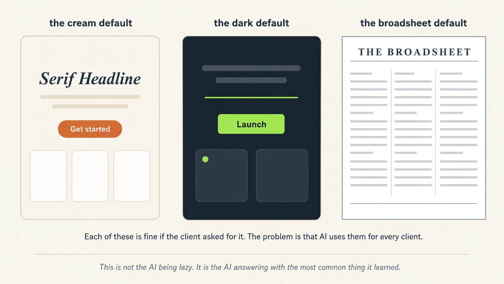
The proof: the AI companies admit it. Anthropic publishes an official design plugin for Claude Code, and that file lists the three looks AI design falls into when nobody stops it. It is specific enough to name the exact shade of cream (#F4F1EA):
- A soft cream background, a large fancy serif headline, and an orange-brown button.
- An almost-black background with one bright acid-green or red accent.
- A newspaper look: thin lines, square corners, and dense columns of text.
The skill calls these "defaults rather than choices," and tells the model not to use them unless the brief actually asked for that look.
Read that one more time. The company that built the AI wrote a file to argue with its own AI. That file is the starting point of this entire course.
And notice the exact words it uses, because they are doing more work than they look. It does not say Claude falls into three looks. It says AI-generated design right now falls into three looks. The habits are not one company's quirk. They belong to the whole field, learned from the same web.
Two consequences follow, and they shape everything below:
- The habits travel between AI models, so a second opinion is not automatically a second eye. Anthropic's file describes the three looks as where AI design in general lands, not where its own model lands. Different companies train on much the same web, so they drift toward much the same average. This matters later: when you ask a second AI to review the first one's work (Concept 12), you are hoping it does not share the blind spot, and the further apart the two are, the better that bet. Only a rules file breaks the chain reliably.
- The fix is never "prompt harder." "Make it unique" is itself a very common request, so it gets a very common answer. The fix is structural: a taste file that bans specific patterns, forces structural variety, and checks the output against gates before handing it back. That is Part 2.
2. The four-piece stack
Every website in this course is built from four pieces. Learn these four and you have a place to put everything else in the course:
| Piece | What it does | What we use |
|---|---|---|
| The model | Writes the code that makes the page | Kimi K3 for design, Claude for reviewing |
| The taste | Stops the AI from using its boring default look | The Hallmark skill file, plus Anthropic's frontend-design plugin |
| The media | Real photos and video, because boxes and text are not a brand | Four lanes, from free photos to paid video (Concept 9) |
| The host | Puts the page on the internet at a real web address | Vercel, which your AI can control by itself |
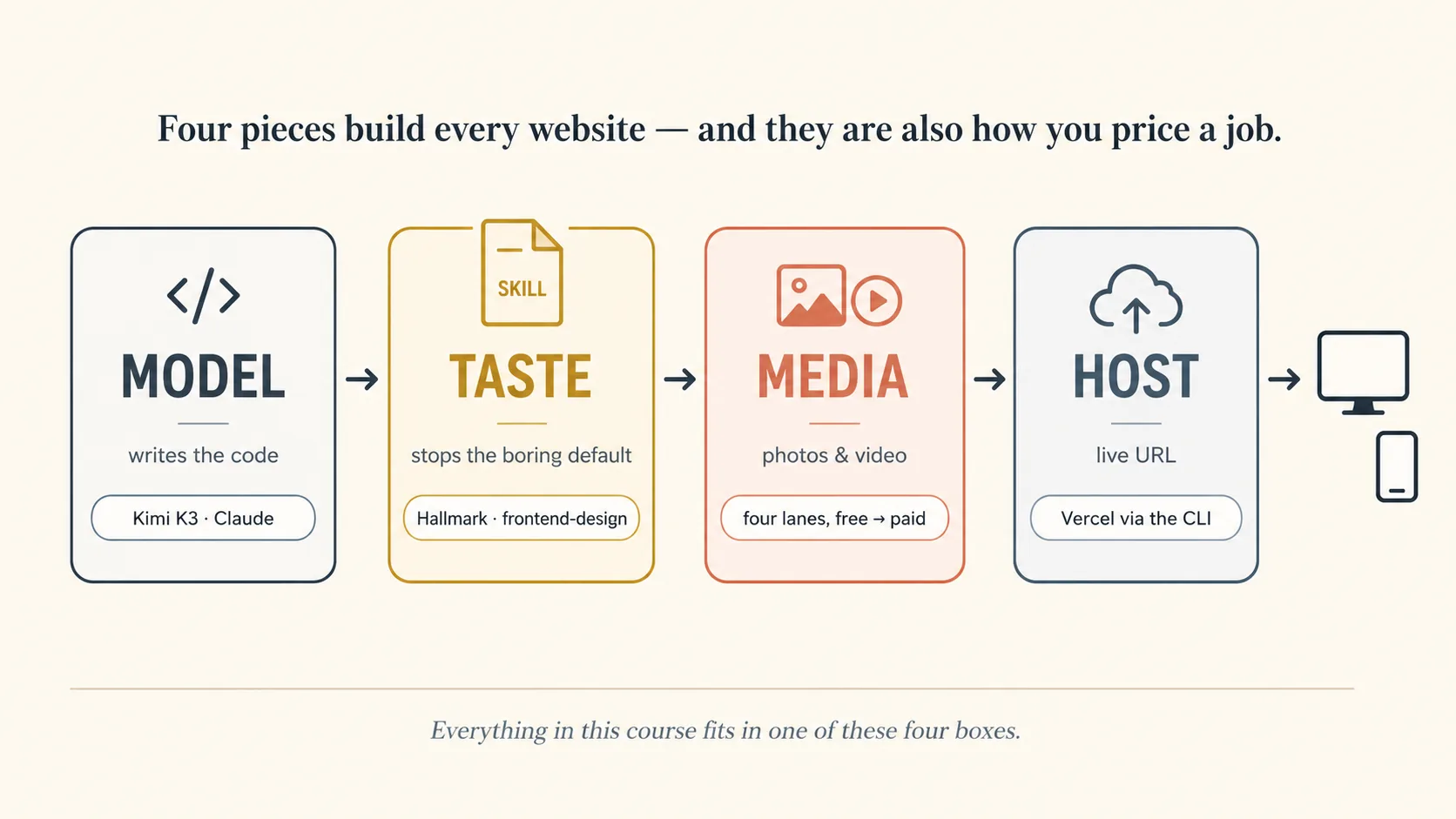
Notice what is not on this list. No website builder. No template shop. No drag-and-drop editor. The tool you already know does all of it.
A comparison that may help: picture a small workshop. The model is the worker. The taste file is the handbook you hand the worker. The media is the supply cupboard. The host is the door where finished work goes out.
These four boxes are also how you price a job. When you build for a paying client, you quote the work by walking through the boxes one at a time. Which AI does the job need? How much design study does their brand require? What photo or video budget do they want? Where will the site live?
Four boxes, four lines on your invoice.
3. Choosing the design model
The coding crash course gave you a simple rule: use a strong AI to decide what to do, and a cheap AI to do it. Design adds a third row to that table.
| The work | Reach for |
|---|---|
| Planning, architecture, debugging something confusing | The most capable model you have |
| Following an approved plan: routine edits, formatting, tests | A cheaper or free model |
| Visual design and front-end polish | Whatever leads the design arena this quarter |
Why does design need its own row? Because being good at design does not come from being generally smart. It comes from two other things:
- Practice. Some AI companies simply train their model on more web design work than others do.
- Being able to see. An AI that can look at a picture of its own page is doing what a human designer does: build, look, fix. An AI that only reads its own code is designing blind. Kimi K3 can see, and that is most of why people prefer its pages.
Three habits will keep you from following hype:
- Trust blind tests, not announcements. On sites like LMArena, real people compare pages made by different AI models without knowing which made which, then vote. That is much better evidence than a company praising its own product. In July 2026, Kimi K3 was first for web design while ranking below Claude and GPT overall. That gap is the lesson: being best at design and being best overall are two different competitions.
- Let one AI build and a different one judge. Kimi K3 builds the page, Claude reviews it. Concept 12 shows you how.
- Expect the leader to change, and notice how little that costs you. Hand the same taste file to whichever strong model leads next quarter and you will get comparably good work out of it, because most of what separates a made page from a generated one is now sitting in the file rather than in the model. That is the whole argument of this course, and it is also your insurance policy. The name at the top of the leaderboard is the part you are least attached to.
Two honest downsides of Kimi K3. It thinks hard by default, so it is slower and talks more than you expect. That is fine while designing, and annoying for small chores. And its low price depends on a discount that only applies when your conversation stays tidy, which Concept 15 explains.
4. Any model in your tool
The coding crash course showed you how to run a different AI inside your tool. You do the same thing for Kimi K3. This is one of the few places where Claude Code and OpenCode really differ, so pick your tab.
Before the setup, one sentence about what you are actually doing. Your tool normally sends its questions to one company's AI. You are changing the address it sends them to, so the questions go to Kimi K3 instead. Nothing else about the tool changes.
Claude Code talks to Claude by default. But Moonshot built its service to accept messages in the same format Claude Code sends, so Claude Code can talk to Kimi K3 with no extra software.
You need a key from platform.kimi.ai. A key is like a password that lets your computer use their AI, and it is tied to your account. Two things to know before you start:
- Add a small amount of money to the account first. The key does not work on an empty account.
- The lowest paid level allows very few messages per minute, which makes the AI feel broken rather than slow. Add enough to move past the first level before you judge it.
Now paste this into .claude/settings.json inside the project folder where you want to use Kimi K3. (Keep this in a separate folder from your normal work, so your other projects still use Claude.)
{
  "env": {
    "ANTHROPIC_BASE_URL": "https://api.moonshot.ai/anthropic",
    "ANTHROPIC_AUTH_TOKEN": "YOUR_MOONSHOT_API_KEY",
    "ANTHROPIC_MODEL": "kimi-k3[1m]",
    "ANTHROPIC_DEFAULT_OPUS_MODEL": "kimi-k3[1m]",
    "ANTHROPIC_DEFAULT_SONNET_MODEL": "kimi-k3[1m]",
    "ANTHROPIC_DEFAULT_HAIKU_MODEL": "kimi-k3[1m]",
    "ANTHROPIC_DEFAULT_FABLE_MODEL": "kimi-k3[1m]",
    "CLAUDE_CODE_SUBAGENT_MODEL": "kimi-k3[1m]",
    "CLAUDE_CODE_AUTO_COMPACT_WINDOW": "1048576",
    "ENABLE_TOOL_SEARCH": "false"
  }
}
That block looks like a lot, but it is only saying three things: where to send messages, what password to use, and which AI to use. Five warnings, all learned the hard way:
- Set every model line, not just the first one. Claude Code quietly uses different AI models for different small jobs in the background. If you only change the main one, those background jobs will still ask for a Claude model that Moonshot does not have, and things will fail in confusing ways. That is why every
ANTHROPIC_DEFAULT_*line is there, including the Fable one people forget. - If you have used Claude Code before, delete your
ANTHROPIC_API_KEY. An old key left lying around fights withANTHROPIC_AUTH_TOKENabove, and the error message you get will not tell you that. This is the single most common way this setup fails for people who are not starting from a clean machine. - Check your setup with
/status, not/model. The/modelmenu only ever shows Claude's own models. Kimi will never appear there, and that is normal, not a bug. Type/statusinstead. It should showkimi-k3and the Moonshot address. - Your key is now sitting in a file as plain text. Never upload that file anywhere public. Add
.claude/settings.jsonto your.gitignorefile so it is never shared by accident. - Web fetching stops working on this route. Moonshot's endpoint does not serve it yet. Everything else works.
That last setting, CLAUDE_CODE_AUTO_COMPACT_WINDOW, is worth understanding rather than copying. Claude Code tidies your conversation automatically when it gets close to full, but it only knows how to do that if you tell it how big "full" is. 1048576 is Kimi K3's one-million-token window written out in full. Leave it out and the tidying either fires far too early or not at all.
One honest note. Moonshot supports this setup. Anthropic does not. Anthropic has said it does not check or support sending Claude Code's messages to other companies' AI models. So if Claude Code updates and this breaks, nobody has promised to fix it. You are trading official support for the freedom to pick your AI. That is a fair trade, as long as you know you are making it.
OpenCode was built to work with any AI, so this is the easy path. It is also where OpenRouter helps most.
OpenRouter is a single service that connects you to almost every AI model: Kimi K3, GPT, Gemini, and many free ones. Instead of making an account with each company, you make one account and pay one bill. Think of it as one key that opens many doors.
Setup takes about a minute:
- Create a key at openrouter.ai/keys and add a small prepaid balance.
- Run
opencode, type/connect, chooseopenrouter, paste the key. - Type
/modelsand pickmoonshotai/kimi-k3(exact ID as listed in the picker — IDs shift, trust the menu).
That is all. Everything you already know still works, and Kimi K3 is now simply one more choice in the list.
A good setup for this course: Kimi K3 for building the design, a cheap model for small chores, and Claude or GPT connected as well so you have a second opinion available for the review step in Concept 12.
Two things to watch. OpenRouter charges slightly more than going directly to Moonshot, because it is doing the connecting for you. That is fine while learning. And Kimi K3 writes long answers, so keep half an eye on the usage number your tool displays. Long answers cost more.
Whichever route you choose, build your habits around your tool and your files, never around one AI model. The AI at the top of the rankings is wearing a rented crown, and it will be handed to someone else. Your files stay.
Part 2: Taste as a skill
5. Hallmark: a taste file with teeth
Part 1 described the problem. One free file fixes most of it.
Hallmark is a design skill by Hassan El Mghari, published under the Together AI banner. It is free, anyone can use it, and it became one of the most popular skill files of 2026. It describes its own job in one sentence: make the pages an AI builds look made, not generated.
It is also the clearest example in this whole book of what a skill file can do. Remember the promise from the coding crash course: the AI brings general knowledge, and the skill brings your specific judgment. Hallmark is that promise, built by experts, handed to you for free.
Install it the modern way, in either tool:
npx skills add Nutlope/hallmark
This opens an interactive picker: it finds the skill, lists the agents installed on your machine, and asks which to install to. Claude Code, OpenCode, and Codex are usually pre-selected, so for most readers the answer is to press enter. Two flags are worth knowing when you want no prompts at all: -g installs globally (user-level, available in every project) and -y skips the confirmations, so npx skills add Nutlope/hallmark -g -a claude-code -y is the one-line version. Re-run any time to update, and npx skills list shows what you have.
The files land in a folder called ~/.claude/skills/hallmark/. OpenCode reads that same folder, so one install serves both tools.
Open that folder once and look inside. The way it is organized is itself a lesson. There is one short main file, SKILL.md, and next to it a references folder holding everything else: the list of 58 checks, a file about fonts, a file about color, a file about spacing, the 21 page shapes, and the themes.
Why split it up like that? Because the AI only reads the extra files when it actually needs them. The main file stays small, so it costs almost nothing to keep loaded. This is exactly the lesson from the coding crash course, built by someone else, for you to copy.
One honest note the install itself teaches: the tool prints a reminder that skills run with full agent permissions and should be reviewed before use. That is correct and worth taking literally — a skill is instructions your agent will follow. Read SKILL.md of anything you install, from this course or anywhere else.
What is inside the file. Hallmark is not a collection of pretty pictures. It is a set of working parts:
- It picks the page's shape first. Before choosing any colors, it chooses a structure for the page from a list of 21 different shapes. This is the part that makes Hallmark special. Most attempts at "make it different" only change colors. Hallmark changes the skeleton. Two pages it builds for two different clients should not have the same order of sections. Painting the same skeleton a new color is exactly the problem it exists to solve.
- Twenty named themes, plus Custom. Each theme is a coherent identity: palette, type pairing, spacing character (the catalog runs Specimen, Atelier, Brutal, Newsprint, Studio, Manifesto, Terminal, Midnight, Almanac, Garden, Riso, Sport, Bloom, Coral, Cobalt, Aurora, Editorial, Carnival, Lumen, Hum). It does not pick freely: a rotation rule keeps it from settling into one theme across your projects, scoped to the genre the brief belongs to. When a brief carries creative intent no catalog theme fits, it switches to Custom and builds a made-to-measure palette and font pairing from scratch — same gates, no template underneath. For ordinary briefs the fork stays invisible: you never see the words catalog or custom.
- A long checklist before it hands the work back. The skill tests the finished page against a list of known bad habits, then criticizes its own work one more time before showing you anything. (A small detail worth knowing, because it teaches you something: the project's front page says 57 checks, while the checklist file you actually install is headed 58. Numbers in documentation drift. When a page and a tool disagree, believe the tool.) This is the coding crash course's lesson in new clothes: a demanding checklist you saved once beats a lazy request you type when you are tired.
- A safety rule. If you point it at a website that already exists, Hallmark will not delete files or tear out sections without telling you first and getting your approval. A design skill is not permission to destroy someone's site.
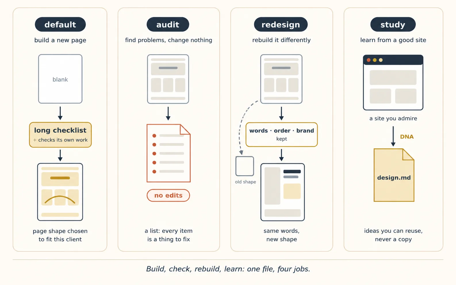
The four modes. Hallmark can do four different jobs. The first is simply what it does when you ask for a new page; the other three you name. Learning which one fits which moment is most of learning the skill:
| Command | What it does | When you use it |
|---|---|---|
| default | Builds a new page: picks a shape, applies the rules, runs the 58 checks | You are starting something new |
| audit | Looks at a page that already exists and lists what is wrong. It changes nothing | You want an honest review (Concept 11) |
| redesign | Throws away the old shape, keeps the words and the brand, and rebuilds it differently | The page works but looks generated |
| study | Looks at a website you admire and writes down what makes it work | You want to learn from a good site (Concept 6) |
Hallmark did not appear from nowhere. Its own file says where its ideas came from, and one of the sources is Anthropic's frontend-design plugin for Claude Code.
The two files are worth comparing, because they solve the same problem in different ways.
Anthropic's skill teaches judgment. It says things like this. Work like a designer at a small studio. Make the top of the page say something real. Let the fonts carry the personality. Be bold in one place and quiet everywhere else. And look at a picture of your own work before you call it finished.
Hallmark provides machinery. Lists of page shapes. Named themes. Numbered checks. A required self-review.
Both are useful, and they work together. Install Anthropic's plugin and it helps with everyday design work automatically. Call Hallmark by name when you want the full treatment. One warning: with a non-Claude model like Kimi K3, the AI is less reliable about picking up skills on its own, so type Hallmark's name every time instead of hoping.
Does the skill make the AI produce the same page every time? No. An AI always has some randomness, and a skill narrows what it will do rather than removing that. Hallmark stops it reaching for the same tired shape; it does not make two attempts identical. For things that must be true every single time, you need a rule the AI cannot ignore, and Concept 11 shows you how to build one.
6. Study, don't clone
The fastest way to improve a design is to point at one you like and say "make it feel like that."
The fastest way to ruin your reputation is to copy that site exactly.
Hallmark's study command handles this well, and the way it works will teach you a lot about design.
Show study a website you admire, or even just a screenshot of one, and it writes down what makes that site work: the shape of the page, which fonts go together, the main color, how much empty space it uses. It saves all of this into a file called design.md.
What it will not do is copy the site. It takes the ideas, not the pixels. Two sites can share ideas the way two students can share a teacher: you can tell they are related, but they are not the same person.
Copying is wrong and can also cause legal trouble. Three practical reasons matter as much:
- The file travels.
design.mdis your taste written down. Give it to a different AI, a different tool, a teammate, or the client for approval, and the design direction survives the handover. - It trains your eye. Read three of these files from three sites you love and you will start noticing structure and fonts everywhere you look. The skill teaches you while it works.
- It solves the hardest problem for beginners. Most people cannot describe the look they want. Everyone can point at a site they like.
studyturns pointing into instructions.
A rule worth following: study two or three sites per project, never just one.
One example pulls you toward copying it. Three examples force you to combine ideas: the shape from one, the fonts from another, the restraint of a third. Combining is where work that feels original comes from.
7. Brand extraction: the client's DNA is already online
Concept 6 was about sites you admire. Client work is the opposite. The design you must respect already exists, because it is the client's brand: their logo, their colors, their fonts, the way they speak. Get these wrong and nothing else you build will matter to them.
The main idea here: ask for specific things, not for everything.
If you point an AI at a whole web page, you hand it a mess of code, scripts, and cookie pop-ups. Buried in that mess, it will confidently invent a color that is not really there. AI models do this: when they are unsure, they produce a confident-sounding guess. Your job is to make guessing impossible.
Route 1: ask your AI, but ask precisely (free). Have it open the client's site and request exact things, with proof:
From this page, list the exact color codes of the three most-used brand colors, the names of the fonts, and the address of the logo file. For each one, quote the line of code where you found it.
That last sentence is the important one. A color code on its own is a guess. A color code with the line it came from is something you can check yourself. Always ask for the receipt.
Route 2: use a tool built for it (paid, cleaner). Services such as Firecrawl exist to turn messy web pages into clean, organized information for AI. Some will hand back a brand's logo, colors, and fonts directly. For one client, route 1 is fine. If you do this every week, a paid tool removes a whole category of mistakes and pays for itself. (Worth knowing: the videos this course is based on were paid to promote tools like this. The idea is sound. The specific brand is your choice, with today's prices in front of you.)
Route 3: just ask the client. Never skip this one. Real businesses have real files: the proper logo, the official colors, sometimes a brand document. Everything above is for your first draft. Before anything goes live, ask for the real files. A logo you rebuilt by eye will eventually be noticed, and it will be embarrassing.
However you get them, the answers go into the same file: design.md. But mark them clearly as rules, not suggestions.
There is a real difference. The sites you admired in Concept 6 are direction: ideas to borrow from. The client's brand colors are rules: they cannot be changed because you found something prettier. Your taste skill designs inside those rules.
Part 3: The build
8. One story, one scroll
Open the best websites you know and notice something they share. The page is not a pile of sections stacked up. It is a story, told in the order you scroll.
One idea per screen. Each screen makes you want the next one. Scrolling is how the story moves.
This is the strongest idea in the course for making a page feel intentional, and it is easy to plan:
- Write the story before any building starts. Five to eight steps, one line each. We call these beats, like beats in a film. For a honey company: wild honeycomb, then a drop falls, then the jar fills, then what is inside, then who makes it, then buy. For the accountant we build for later: a shoebox of receipts, then sorting, then the accounts balancing themselves, then a clear monthly picture, then the person behind it, then book a meeting. Write the beats, argue about them, agree on them, and save them in a file before anything is built.
- One idea per screen. If a screen tries to make two points, it makes none. Split it into two screens.
- The top of the page must show the real thing, not a slogan like "Innovative solutions for modern business." The honey site opens with honey falling. The accountant's site opens with the shoebox of receipts every small business owner recognizes instantly.
- Pick one moment to be bold, and keep everything else calm. One thing a visitor could describe to a friend afterwards: an animation, something that reacts when you scroll, a striking use of type. Being bold in one place looks confident. Being bold everywhere looks like a mess.
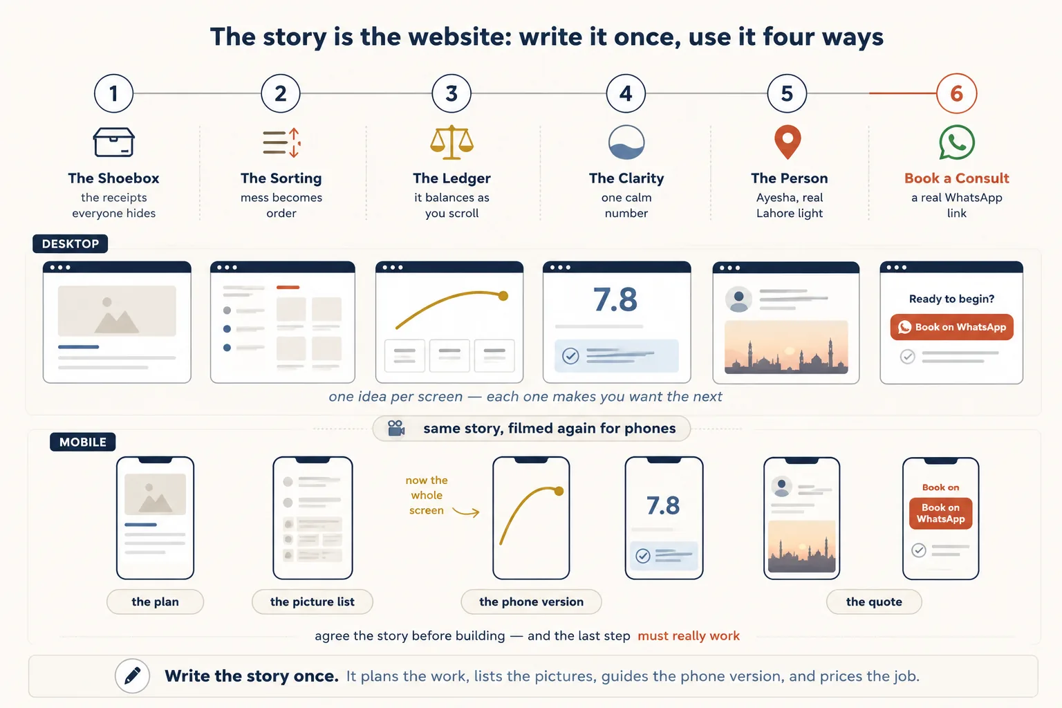
The story spine is also your responsive contract and your media shot-list. Hold on to it: Concept 9 generates imagery per beat, and Concept 10 re-shoots the same spine for a different screen shape. One artifact, three jobs — which is exactly why it gets written down instead of held in your head.
The last beat has to actually do something. Every story ends with one action: book, buy, message, subscribe.
Here is the trap that catches nearly every first website. A simple website is just files. It has no system behind it that can receive a message. So the beautiful button at the end of your story does nothing at all unless you choose how it works. Three honest options, cheapest first:
Option 1: a WhatsApp link. This needs nothing extra, and for most small businesses it is the best answer. A link like this one:
https://wa.me/923001234567?text=Hello,%20I%20would%20like%20to%20book%20a%20consultation
opens WhatsApp with the message already typed. No system to build, no form, nothing to check. Best of all, the message arrives where the owner already replies to customers all day. Most website templates ship a contact form that nobody ever checks. A WhatsApp button beats that easily.
Option 2: a form service. Companies such as Formspree let you put a normal form on your page, and they email you whatever people submit. Their free plans are enough for a small business. Use this when the client really wants a form.
Option 3: a small program on the server. Vercel (Concept 13) can run small programs next to your website, so your AI can build a proper system when a project is big enough to need one. This is where the first two options grow to, not where you begin.
Whichever you pick, write it into the story at planning time. "Beat 6: book a consultation, WhatsApp link to +92 300..." is a line you can plan around and check later. And check it you will: Concept 11 shows you how to make sure the finished, live page really contains a working link.
A story that ends in a button that does nothing is not a website. It is a poster.
One note on order. Learn the single page first. Everything in this course is easier to learn on one page. But real client work grows past one page, so this course covers that too: the multi-page section at the end of Part 3 shows what changes when a site needs more rooms.
9. The media pipeline
Here is the honest secret behind every website that made you stop and look: the pictures are doing half the work.
Good fonts and good structure lift you above the average. But a page made only of colored boxes and text still feels like a document, not a place. Real photographs and video are what make a page feel like somewhere you have arrived.
That is why pictures are a required part of this course, not a decoration at the end.
This is also the only part where money really changes what you can do. So we teach it as four lanes, from free to expensive. Every lane can produce a real, good website. Choose your lane per project, and know exactly what each one gives you.

Lane 1: Real photographs (free, forever). Unsplash and Pexels have huge libraries of professional photos you may use for free, including for paying clients. (Read their rules page: you may use the photos, you may not resell the photos themselves.)
Two habits stop free photos from looking like free photos:
- Match the light. Choose photos that share the same kind of light and the same mood across the whole page. Mixed lighting is what makes a page look assembled from strangers' pictures.
- Crop on purpose. Do not accept the photo as you found it. Cut it to show what you want.
And do not forget the option almost nobody uses: for a local business, a phone camera in good evening light beats generic stock photos every time. A real photo of the client's real office is something no AI can produce.
Lane 2: AI-made pictures, free (with one catch). Sometimes the picture you need does not exist anywhere: an unusual illustration style, or a product not yet photographed. AI can make it.
But here is the catch that shapes this whole lane: when it is free, you can have quality or convenience, but not both.
The best picture-making AI is free only if you do the clicking yourself. The ones your AI can use automatically are weaker or less reliable. Pick per project:
2a. By hand, with the best AI: ChatGPT's free plan. OpenAI's image AI is currently one of the strongest widely available options. It follows instructions closely, it can put readable text inside a picture (most cannot), and it keeps a consistent style across a set of images, so a whole page's pictures look like they belong together.
It is free on chatgpt.com, with a limited number of pictures per day. OpenAI does not publish a fixed number and it changes, so check what your own account shows you. There is no free automatic version, which is exactly why this route is done by hand.
Here is the workflow that makes doing it by hand a good thing rather than a chore: your AI writes the instructions, and you press the button.
Your storyboard already has one description per beat. Have your AI polish those descriptions, paste each one into chatgpt.com yourself, save the results into your assets/ folder with names like 01-shoebox.png, and your AI puts them into the page. Ten minutes of copying and pasting buys you the best image quality available, for nothing.
The daily limit even helps you. A handful of pictures a day is roughly the pace of a planned build, and it makes it impossible to fall into the bad habit of generating forty pictures and hoping one works.
2b. Automatic, but weaker: free services your AI can call itself. When you need the work to keep flowing without you — rough drafts, placeholder images, classroom projects — there are three options. Pollinations.ai is the closest thing to genuinely free automatic pictures, with no account needed. Cloudflare Workers AI includes a real free amount each day. Google's free plan has offered free pictures at various times.
That last one carries a lesson. In 2026 alone, Google changed whether its current image AI was free more than once. So the advice to remember is not a company name. It is this: free plans are like weather. Check today's page on the day you build, and never promise a client something that depends on a free amount that could disappear next month.
A good way to use both: make rough drafts with 2b to settle where things go, then remake the approved pictures properly with 2a. Draft cheap, finish well.
Lane 3: Pay a few cents per picture. As soon as a project has even a tiny budget, Lane 2's catch disappears.
The same excellent image AI from 2a can also be used automatically, and you pay per picture: roughly half a cent for low quality, a few cents for medium, around twenty cents for high. (Prices change, so check.)
At those prices you get quality and convenience. Your AI makes every picture in your storyboard by itself, at top quality, and the pictures for a whole website cost less than a dollar. This is where most real client work happens.
Services like fal.ai and Replicate do the same thing across many companies' image AI with one account, exactly like OpenRouter did for text in Concept 4.
The habit that keeps this cheap is the one you already know: make your drafts at low quality, and only pay for high quality once everyone has agreed on the picture.
Lane 4: Video, paid with credits (the showstopper). The honey drop that pours down the screen as you scroll comes from this lane. It costs real money, and used well, it is worth it.
Higgsfield is a service that gives you access to more than 30 different picture, video, and sound AI models through one account (Gemini Omni Flash, Seedance, Veo, Kling, and others). Three things about it matter for us:
-
Your AI can use it directly. You install it once with
npm install -g @higgsfield/cliand sign in once withhiggsfield auth login. After that, making a video becomes something your AI does inside your normal session, the same way it edits a file. It sends the job, waits for it, and brings back the result. -
You do not have to choose the model. Describe the shot you want — "close up, honey dripping onto glass, warm light from behind, tall shape for phones, four seconds" — and the service picks which of its 30+ models does it best. That is one less thing to learn.
-
You can check the price before you spend. The command
higgsfield generate costtells you what a video would cost without making it. You describe the shot the same way you would to make it, so a real one looks like this:higgsfield generate cost workflow draw_to_video --duration 8.2 --resolution 720pThis is the most useful command in the whole media section, because it turns "plan before you spend" from advice into something you can actually do: price every shot in your storyboard, add them up, decide, and only then create. Teach your AI to quote before it shoots.
Higgsfield is one company among several: fal.ai, Replicate, and the AI companies themselves all do similar things. We show this one because it currently connects to your tools most easily, and in the same honesty as before, it pays for many of the videos that made this workflow popular. Learn the idea — making videos as a normal step inside your AI session. The company is replaceable.
Which video AI should you ask for? The service can choose for you, but for website work two models cover almost everything, and they do different jobs:
- Gemini Omni Flash, from Google (currently a preview model, which means it can change or move without notice), is the one that finds the shot. You can talk to it like a person: "same scene, slower pour, warmer light" improves the previous video instead of starting from nothing, and it keeps the lighting and the scene consistent as you refine. Use it while you are still deciding what the shot should be.
- Seedance 2.0, from ByteDance (you will see it named
seedance_2_0), is the one that locks the shot. You can give it up to nine reference pictures — your brand images, your approved photos, your logo — and it is the steadiest at smooth motion. Steady matters here: a video attached to scrolling must not flicker or wobble when it loops. Use it for the final version.
One habit holds both: find it with the first, lock it with the second. And notice that the quality level is not part of the model's name — it is a separate --resolution setting you pass, exactly like the one in the pricing command above. That is your budget control, and it is the same knob in both places: price the shot at 720p, show the client the 720p draft, and only pay for full quality once they say yes.
One standing warning: video AI changes faster than anything else in this course. These are July 2026's best. Check what is best on the day you build.
One rule for every lane: make your pictures from the story, one picture per beat, saved in an assets/ folder with clear names, before the final layout is built.
Pictures added at the end to fill empty space always look like pictures added at the end to fill empty space.
One practical tip: when you need to search through many photos, send a helper AI to do it in a separate conversation and bring back only the best few. Forty photos loaded into your main conversation will clog it, exactly as the coding crash course warned.
A short note on permission, because working for a client is business use.
Free photo sites have rules, and you already know to read them. AI-made pictures have rules too. Most companies currently let you use what you create commercially, but the rules differ between companies, differ between free and paid plans, and change over time. Some free plans do not allow business use at all, which is one more reason to treat free plans as draft tools.
A few things are off limits almost everywhere: real people's faces, other companies' logos, and copying a named living artist's style.
Four simple habits keep you safe:
- Read the current rules of whichever service you use for final pictures.
- Keep a record of what you made: the description you used, the service, the date. Your storyboard already holds most of this.
- Never put a recognizable real person or another company's logo into client work.
- Tell the client which pictures were made by AI. One sentence in your handover note prevents every awkward conversation later.
This is not legal advice. For a client in a regulated industry, that is what real lawyers are for. But these four habits are the normal standard of professional work.
10. Mobile is the primary device
Every AI website demo you have ever watched was recorded on a wide computer screen. Most people who visit your website will be holding a phone in one hand.
For nearly everyone this book is written for, the phone is not the second screen. It is the screen. A site that only looks good on a laptop is a site that only impresses the person who built it.
One idea makes designing for both screens simple:
Same story, filmed again for a different shape.
A film director making a version for phones does not write a new story. The scenes stay. What changes is how each scene is framed. Here is what that means in practice:
- The story does not change. Shoebox, sorting, balancing, clarity, the person, book a meeting — all six on every device. And here is a useful test: if a beat can be dropped on the phone, it was decoration, not story. Remove it from the computer version too.
- The pictures are taken again. A wide video becomes a tall video of the same subject, not the wide one squeezed. On the paid lanes this means making both shapes and paying for both, so put it in your budget. On the free lanes it means choosing both shapes from the start.
- Decide where the layout changes, on purpose. Tell your AI plainly: "on screens narrower than 768 pixels, use the tall video, make each section full width, and make the balancing animation much bigger, because on a phone it is the whole show." Then test it: drag your browser window narrower and wider, and watch the moment it switches. Smooth or ugly is something you can see, which makes it a job for Concept 11.
- Thumbs are not mouse pointers. Buttons must be big enough for a thumb. Nothing important should require hovering, because there is no hovering on a phone. Text must be readable without pinching to zoom. Failing any of these is not a style problem, it is a broken site for most of your visitors.
One practical note about when to do the phone version: do it in the same working session as the computer version, straight after it, while the AI still remembers every decision. Not on another day, and not after a week of other work. Two separate sessions produce two slightly different websites, and you will not notice until your client does.
Where does it sit in the whole build? Right after the design is settled and before the checking starts:
computer version → phone version → screenshots at both widths → audit → second opinion → publish
The reason for that order is simple: the checking steps should check both versions. If you leave the phone version until after the review, you have reviewed half your website.
From one page to many: multi-page sites and routing
Everything so far was taught on one page on purpose. One page is where all these habits are easiest to learn.
But real client work grows. Ayesha will eventually want a services page, an articles section, maybe a page for each thing she specializes in.
The good news: nothing you learned changes. A multi-page site is not a new kind of thing. It is the same work, done once per page, plus three new rules.
Rule 1: every page needs its own reason to exist, and its own story.
The wrong way to add pages is to break one story into pieces, so you end up with an "About" page holding two lonely paragraphs that belonged in the scroll.
The right way uses the same test as "one idea per screen," one level up. A new page exists when a visitor has a different job to do. Compare the services in detail. Read her articles. Find the office. Those are three different jobs, so they can be three pages.
Every page that passes the test gets its own story, written and agreed exactly like Concept 8, ending in its own action.
Write all of this down first, in one plan: every page, its job, and its beats. Approve that plan before building the second page.
Your menu then comes straight out of that plan, instead of being invented as decoration. Keep it short, name the items after what visitors want to do, and keep it identical on every page.
One more small thing that separates careful work from careless work: design your "page not found" screen too. It is a page, so it gets the same care.
Rule 2: one look across the whole site.
This is where Hallmark's main idea flips around, and it confuses people, so read it slowly.
Between different clients, the skill fights sameness. Two clients' websites should not share a skeleton.
Within one client's site, sameness is exactly what you want. Five pages should feel like five rooms in one building: same colors, same fonts, same spacing, all governed by the one design.md.
Your bold moment stays special. It lives on the home page. If you repeat it at full strength on every page, it stops being special and becomes wallpaper.
In practice, build the home page first to settle the look. Then ask for every other page the same way: "same design file, same look, new story."
And when a second AI reviews the site (Concept 12), ask it specifically whether the pages feel consistent. Small differences between pages are exactly what the builder cannot notice from inside the work.
Rule 3: web addresses are just files, until copying becomes a problem.
Here is something that sounds complicated and is not. On a simple website, the file is the address:
index.htmlis your home pageservices.htmlis at/services.htmlarticles/index.htmlis at/articles
Links connect them, and your host puts the folder online exactly as it is. There is no system to learn. Start here, always.
One small tidiness setting worth knowing: if you prefer /services to /services.html, add a file called vercel.json next to your pages containing { "cleanUrls": true }. Vercel then drops the .html from your addresses. It is off by default, so nothing breaks if you never touch it.
The real difficulty of many pages is not addresses. It is copying. Your menu and footer now exist as copies inside every single file. Five copies of one menu is five chances for them to end up slightly different, and one day one page will have an old link nobody noticed.
You know this feeling from the coding crash course: when you explain the same thing a third time, the knowledge wants to live in one place.
Two answers, from light to heavy:
- The light answer: keep the simple files and add an automatic check that refuses to save your work if the menus are not identical across pages. Now drift is impossible instead of merely unlikely.
- The heavier answer: once the site has more than a handful of pages, or gains new articles regularly, move to a system that writes the menu once and reuses it. Astro suits this kind of site well, and your AI can set it up and move your existing pages into it on one instruction.
The judgment is the same one the coding crash course taught about tools in general: take on the heavier system when a real problem has earned it, not before.
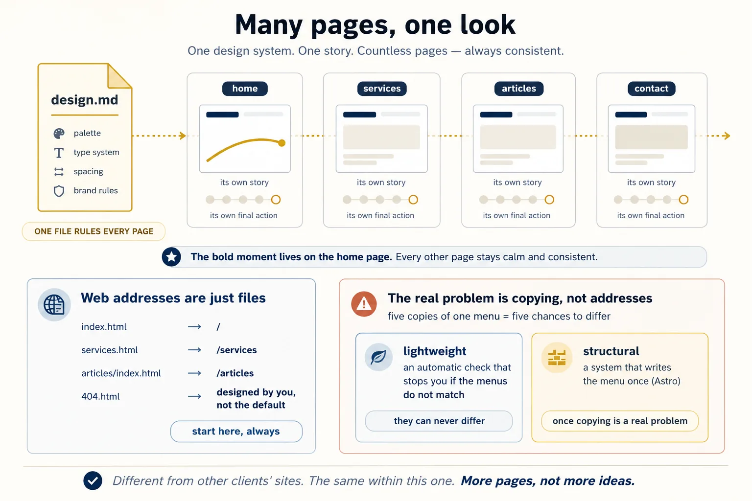
Everything else simply repeats, once per page: screenshots at both widths, the audit, the phone version, the sitemap entry, the weight limit, and a line in your cost estimate. More pages means more surface to cover, not more ideas to learn — which is exactly why we started with one.
Part 4: Verification for design
11. The visual verification loop
The most important pattern in this whole book is a loop: try, check, fix, repeat. The AI does the work, something checks it, and if the check fails, that failure message becomes the AI's next instruction. The AI keeps going until the check passes, with nobody in the middle.
In the coding crash course, the checker was a test. Design has always seemed impossible to check this way, because "it looks right" is not something a computer can pass or fail.
This concept fixes that. Three checkers, from gentlest to strictest:
Checker 1: the screenshot. Give the AI eyes.
This is the single most valuable habit in the course, and it is simple. After every round of building, the AI takes a picture of the finished page and looks at that picture — not at the code.
Why does this matter so much? An AI reading its own code cannot tell that two pieces of text are sitting on top of each other. It cannot tell that a video failed to load, or that a button is the same color as the background behind it, or that the layout falls apart on a narrow screen.
One look at a picture catches all four instantly.
This is exactly why Kimi K3 wins design comparisons, and Anthropic's own design skill sums it up in a line worth stealing: "a picture is worth 1000 tokens." Tokens are what the AI pays to read something. So that sentence is not a proverb. It is a claim that looking is cheaper than reading the code, as well as better.
Make it automatic by putting it in your rules file:
After every significant change, take a picture of the page at 1440 pixels wide and at 390 pixels wide, and look at both before saying you are done.
Both tools can do this. Ask yours to set up a program called Playwright and it will handle it. The whole thing is about a dozen lines of code it writes once: open a browser, load the page at each width, save the picture, close.
Two details make the pictures actually useful. Capture the whole page, not just the part you see first — a scroll story lives below that. And once your site is online (Concept 13), take the pictures of the live page, not the copy on your computer.
Checker 2: the audit. Turn taste into a list.
Hallmark's audit command reads your page and hands back a list of specific problems. It changes nothing. It just tells you.
A list is exactly what the loop needs, because every item on it is a next instruction. Build, audit, fix the list, audit again, until the list is empty.
Look at what just happened. "Make it less generic" is an instruction that can never fail, so it can never drive anything. "Fix these seven specific problems" can be finished and checked. Turning the first kind of sentence into the second kind is the entire trick.
Checker 3: the automatic rule. Guarantee the things that must always be true.
Some things cannot be left to the AI's judgment at all. They must be true every single time. The coding crash course taught you to recognize these and to enforce them automatically, so the AI cannot skip them even if it wants to.
For a website, the classics are:
- Every picture has a text description attached, so people using screen readers know what it shows
- No file is larger than your size limit
- The site builds without errors before anything is saved
One warning repeated from the coding crash course: write these checks yourself rather than asking the AI to write them. An AI asked to build a test against its own habits will helpfully make the test easy to pass.
Here is where a lot of people fool themselves, so read this part carefully. Writing "every picture must have a description" in your rules file is an instruction the AI will usually follow. That is not the same thing as a rule it cannot break. The difference only becomes visible on the day it forgets.
A real check is a small program that answers yes or no. Save this as check-site.mjs in your project. It is Node.js, which you already have because npx and Vercel need it, so it runs the same on Windows, macOS, and Linux:
import { readdirSync, statSync, readFileSync } from "fs";
import { join, extname } from "path";

const MAX = 500 * 1024; // 500KB
const MEDIA = [
  ".png",
  ".jpg",
  ".jpeg",
  ".webp",
  ".avif",
  ".svg",
  ".gif",
  ".mp4",
  ".webm",
];
const problems = [];

function walk(dir) {
  // look in every folder, not just this one
  let out = [];
  for (const name of readdirSync(dir)) {
    if (name === "node_modules" || name.startsWith(".")) continue;
    const full = join(dir, name);
    out = statSync(full).isDirectory()
      ? out.concat(walk(full))
      : out.concat(full);
  }
  return out;
}
const files = ["site", "assets"].flatMap(walk); // only what actually publishes

for (const f of files.filter((f) => extname(f) === ".html")) {
  const html = readFileSync(f, "utf8");
  for (const tag of html.match(/<img\b[\s\S]*?>/gi) || []) {
    // even across line breaks
    if (!/\balt\s*=/i.test(tag)) problems.push(`MISSING DESCRIPTION  ${f}`);
  }
}
for (const f of files.filter((f) => MEDIA.includes(extname(f).toLowerCase()))) {
  if (statSync(f).size > MAX)
    problems.push(`TOO BIG  ${f}  ${Math.round(statSync(f).size / 1024)}KB`);
}

if (problems.length) {
  console.error(problems.join("\n"));
  process.exit(1);
}
console.log("All checks passed.");
Run it with node check-site.mjs. If something is wrong, it prints the file name and stops with a failure. If everything is fine, it says so.
Try it both ways, because seeing it fail is the point. Run it on a good page and it says All checks passed. Now delete one alt="..." and run it again:
MISSING DESCRIPTION site/index.html
That failure is what makes the loop work. Your AI runs the script, reads MISSING DESCRIPTION: services.html, fixes that exact file, and runs it again. Nobody had to notice. Nobody had to remember.
You do not need to understand every line of that script. You need to understand the difference it demonstrates: the rules file asks, the script decides.
Add more rules as you learn what your work gets wrong. A rule that the menu is identical on every page. A rule that the page really contains a working contact link. A rule that the title is not still "Home." The version in the download package has six rules, and every one of them exists because something went wrong once.
And know what this cannot catch. In the finished Ayesha project, the ledger in beat 3 totalled PKR 217,950 while beat 4 displayed PKR 217,930. On an accountant's website. The audit did not catch it, the reviewing AI did not catch it, and the screenshots did not catch it, because every one of them was checking whether the page looked right — and it did. A person adding up three numbers caught it.
So: automate everything that can be checked, and spend the attention you save on the part that never could be. That is not a consolation prize. It is the job.
Two groups of rules worth having from your very first build.
Group one: everyone can use the site. Text must have enough contrast against its background to be readable. People who navigate with a keyboard instead of a mouse must be able to see where they are. Animations should stop for visitors who have asked their device to reduce motion, because motion makes some people ill. Anthropic's design skill describes this as a floor you build to quietly, without bragging about it. That is the right attitude: this is the minimum, not a feature.
Group two: the page is light enough to load. In most of the world, and certainly in Pakistan, many visitors use mid-range phones and pay for their data by the megabyte. A beautiful 40 megabyte video is not impressive to them. It is a reason to leave.
So set limits and enforce them automatically:
- The first screen should load in under about 1 megabyte, before any video arrives
- Every video has a still picture behind it, so the page looks good before the video loads
- Pictures further down the page load only when the visitor scrolls to them
- Any video that plays by itself must be silent, because a sound surprise makes people close the tab
A site that looks stunning on your fast connection and fails on your visitor's phone has failed most of its audience. And unlike taste, every one of these is something a computer can check.
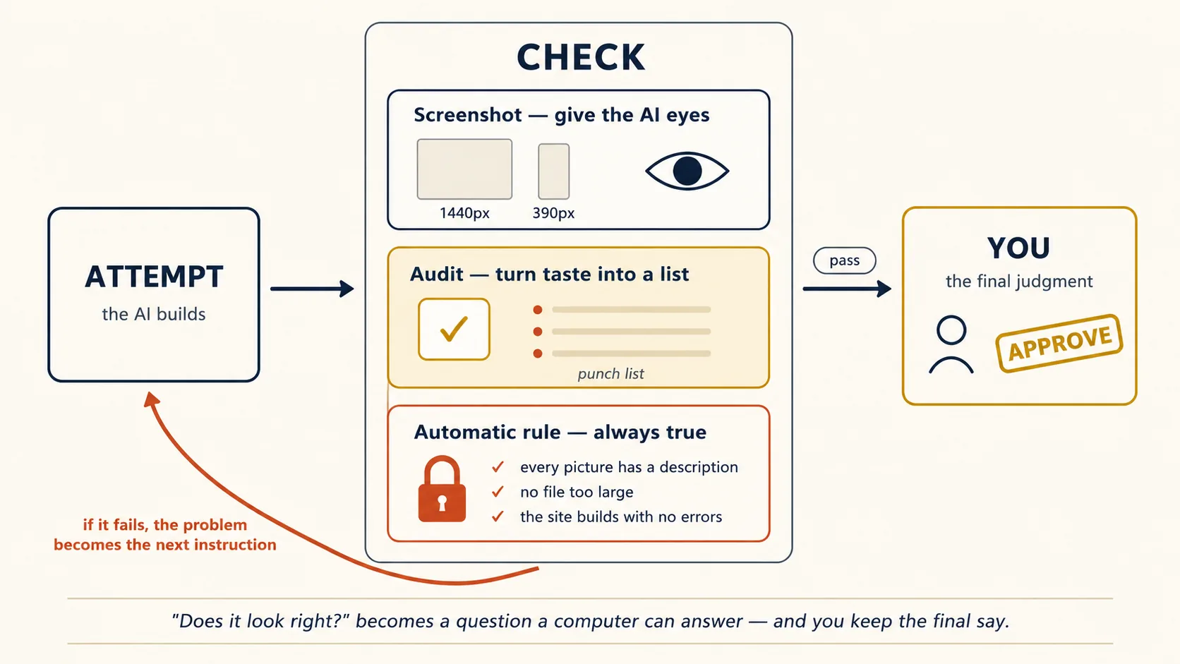
Where you still stand. The loop converges on correct and non-generic. It does not converge on right for this client — whether the page feels like Ayesha, whether the bold moment lands, whether the story beats breathe. That judgment call was never delegable, and the third belief from the top of this course told you why: trust extends exactly as far as the checkable. The loop's gift is that it spends your judgment only where judgment is actually needed.
12. Cross-model design review
The coding crash course gave you this rule: the AI that made something is the worst one to review it.
Design makes the rule stronger, and Concept 1 explains why: an AI cannot see its own habits. From the inside, its favorite look does not seem like a habit at all. It seems like "how websites look." A different AI, which learned differently, spots those habits immediately.
Here is how to set it up:
- One AI builds. Kimi K3 (or Claude) makes the page.
- A different company's AI reviews it. Not the same AI asked twice, and not a sibling from the same company. A genuinely different one. Give the reviewer three things: the original brief, the
design.md, and the screenshots. Screenshots matter, because a design review that only reads code is theatre. Then ask demanding questions, such as: compare this page against the brief, name three places where it looks AI-made and explain why, check that the story still works on the phone version, check that the colors and fonts match design.md exactly, write the findings into a file, and change nothing. - The builder reads the findings and fixes them. If the two AI models disagree, you decide.
Why insist on a different company? Because of the test mentioned in Concept 1: Kimi K3's pages showed habits that looked like another AI's, most likely learned from it. Two AI models can share the same blind spot without coming from the same company. A reviewer from somewhere else is the cheapest way to catch what neither builder can see about itself.
One extra benefit: because the review is saved as a file, you can show it to your client. "An independent review found these five issues, and all five are fixed" is a very good sentence to be able to say.
Part 5: Ship
13. Deploy: from folder to URL
A website sitting in a folder on your computer is a rehearsal. The real performance starts when someone in another city can open it on their phone.
Putting a website online used to be a whole course by itself: servers, addresses, security certificates. Today your AI can do it for you.
Vercel is the service this course uses. Its free plan is enough for learning projects and for showing work to clients, and your AI can control it directly. Make an account once, then tell your AI:
Connect to Vercel via the CLI and deploy this project.
Your AI installs what it needs, opens a browser once so you can sign in, and puts the site online.
Two commands matter, and the difference between them is the difference between rehearsal and performance:
vercelcreates a preview: a temporary web address, perfect for sending to a client with "have a look at this."vercel --prodputs the site at the real address, the one that belongs to the business.
Every time you make changes, you get a fresh preview. So working with a client becomes a comfortable rhythm: build, send preview, get feedback, build again, send a new preview. The real site stays untouched until they approve.
Three habits and you know enough:
- Previews are for changing things. The real address is for finished things. Never show work-in-progress from the real address, and never leave a client looking at an old preview.
- Do your final checks on the live page, not on your computer. Fonts, videos, and links find new ways to fail once a site is online. Point the picture-taking from Concept 11 at the live preview address, both widths, before any human looks at it.
- Other services do the same job. Netlify, Cloudflare Pages, and GitHub Pages all work the same way. The skill you are learning is letting your AI publish for you. The company is just a preference.
Your own web address is the real finish line.
No client thinks a site is finished while its address ends in .vercel.app, and they are right. The address is part of the brand.
Getting one is a short errand:
- Buy the address from any seller. In Pakistan, a
.pkaddress comes from PKNIC, and a.comfrom any international seller. - Add it in your Vercel project's settings.
- Vercel shows you two or three values to copy into the seller's settings page. Copy them across. Your AI can walk you through the screens.
It takes anywhere from a few minutes to a few hours to start working.
Two professional habits go with this. Buy the address in the client's name, in an account they control. A freelancer who owns a client's web address has accidentally taken a hostage, even with the best intentions. And the padlock that makes a site secure is automatic here, so if a browser warns about security, the address settings are wrong, not the site.
Make sure people can find it. A site nobody finds fails quietly. One short pass covers the basics, and it pays forever:
- A real page title. "Ayesha Rehman, Chartered Accountant, Lahore" — not "Home." This is what appears in search results and browser tabs.
- One sentence describing the page, written for a human scanning a list of search results.
- A sharing picture. This is the one most tutorials skip, and the one that matters most here. When someone shares your link on WhatsApp, a small card appears with a picture and a title. A link that turns into a handsome card gets opened. A bare grey link does not. This picture is just another job for your media pipeline: export the top of your page at 1200 by 630 pixels and save it as
og.png. - A list of your pages for search engines, which your AI generates in seconds, plus registering the site with Google from the client's own account.
Test the sharing card the honest way: paste the preview link into a WhatsApp chat and look at what appears.
14. The client workflow
Everything so far, you were building for yourself. The moment someone is paying you, the same work needs a set of professional habits around it.
This concept is those habits, told through the project we build in Part 6: Ayesha Rehman, an accountant in Lahore, launching a website for her practice.
Six steps:
- Agree in writing before you build. One page is enough: who the site is for, the one action a visitor should take, the story beats you agreed, and what "finished" includes — how many pages, whether the phone version is included, where it will be published, and who provides the photos. Six weeks later, when someone remembers the agreement differently, this page is what settles it. Memory is not a contract.
- Find the brand, then confirm it. Use Concept 7, and remember its rule: what you find online is your draft, what the client sends you is final. Ayesha's old site gives you her colors, but the phone call reveals she is in the middle of changing her logo. That one call just saved you from building the whole first version wrong.
- Sell the story, not a picture of the finished page. Before you build anything, send the six beats, one line each. A client who approves the story gives you feedback about substance. A client shown a finished design first gives you feedback about the exact shade of blue. The order you show things in is your most underrated tool.
- Have them review on their own phone. Not screenshots pasted in a chat. Send the preview link and say "open this on your phone." That is the device their own customers use. It is also the moment all your phone-version work quietly sells itself.
- Price the job using the four boxes. Model: almost nothing, so absorb it rather than listing pennies on an invoice. Taste: this is your time, and it is your main line. Media: this is the honest conversation — "stock photographs are included, and a custom video like this example costs X extra." Because you can check prices before generating, X is a number you can state confidently instead of guessing. Hosting: free for now, moving to their own account and web address when you hand over.
- Hand over properly. Give them everything: the files, the site published under an account they control, the web address in their name, the
design.md, and simple visitor statistics if they want them.
Add one more thing: a single page explaining how to ask an AI to make small changes to the site.
That last item is new to this era, and clients remember it. You are not only delivering a website. You are delivering the ability to look after it.
The move that compounds: after your first client, save the whole process as a skill file — the agreement template, how you find the brand, the story format, the review questions, the publishing steps, the handover list. Your second client then costs half the effort of the first, and by the fifth the file is doing most of the work.
This is the central idea of this book at the size of one freelancer: the thing that lasts is never the website. It is the system that makes websites.
15. Cost discipline
The coding crash course taught you how to keep AI conversations cheap. Websites add two new costs: pictures are priced per picture, and using a different company's AI changes the discounts you get. Three habits handle it.
Price the pictures before you make them.
Here is the surprise: on a Kimi K3 build, all the code for a whole website costs less than a cup of tea. One custom video can cost more than everything else put together. Pictures are the budget, not the AI.
Luckily you can check prices before spending. The command higgsfield generate cost tells you what a video would cost without making it. So your storyboard becomes a quote: six beats, six prices, one total, decided before you spend anything.
Put it in your rules file so you never forget:
Before making any picture or video, estimate the cost of every planned shot and tell me the total.
Then follow the same discipline everywhere: list every beat, its lane, and its shape before anything is made, review the whole set, and only then pay for final quality. The expensive mistake is never one picture. It is making thirty while you slowly work out what you wanted, because you never wrote it down first. And the phone version doubles the list — put that in the price you quote, not in the surprise later.
Using another company's AI brings the conversation costs back. Kimi K3 charges about ten times less for text it has already seen than for text it is reading for the first time. That discount is the whole reason it feels cheap, and it only applies while the start of your conversation stays unchanged. Restart the conversation, or edit something near the top of it, and you go back to paying full price for everything.
Two habits follow. Set CLAUDE_CODE_AUTO_COMPACT_WINDOW as Concept 4 showed, so the automatic tidying actually knows how big this model's memory is. And keep doing what you already learned: watch the usage number, tidy at natural stopping points, and save important facts into files first, because files do not get tidied away.
Learn what one project actually costs you.
After your first complete website, write down the real numbers: what you spent on the AI, what you spent on pictures, and how many hours you worked.
Ayesha's site in Part 6 costs a few dollars of AI time, plus a picture budget that is either zero, under a dollar, or a video price you checked in advance.
That number changes everything. It turns "can I afford to practice this?" into "yes, every week." And when a client asks what a website costs, you will state a number instead of guessing.
Part 6: A complete worked example, twice
Now we put everything together. One real website, from empty folder to live web address, done once in Claude Code and once in OpenCode. Where the two tools differ, it is marked.
Everything described below exists as real files, not as a description of files: the working website and its designed 404 page, the sharing card, the two photos, the six-beat story spine, the design.md with her brand rules, the rules file, the Hallmark audit (seven findings, then zero), the independent review from a different company's AI, the cost record, the checker, the screenshot script, and full-page screenshots at both widths taken from the actual page.
Download the Ayesha project · unzip, then npm run check. Delete one alt="..." and run it again to watch it fail.
Read docs/defect-log.md first. It lists all eight defects this project shipped with at one point and names what caught each one — and the most serious one, an accountant's ledger that did not add up, was caught by none of the automatic checks. It was caught by a person doing arithmetic. That is the ratio this whole course argues for.
The build
The client: Ayesha Rehman, an accountant in Lahore. She is relaunching her practice using AI tools, and her current website is one old page with an outdated logo.
She wants visitors — small business owners in her city — to feel two things while scrolling: this person understands my mess, and this person has already solved it.
The agreed story spine (Concept 8, drafted with Ayesha, six beats):
- The shoebox — receipts, everyone's guilty secret, shot warm and human
- The sorting — chaos becoming categories
- The ledger that reconciles itself — the bold moment: an animated ledger line that balances as you scroll
- The monthly clarity — one clean statement, one calm number
- The person — Ayesha, her office, her credentials, real Lahore light
- Book a consultation — one action, one button
What you will deliver:
- A computer version and a phone version, from the same story
- Her brand colors and fonts used exactly
- Beat 6 connected to a real WhatsApp link, with the message already typed
- The findability basics done: page title, description, and a sharing card that looks good when she sends the link on WhatsApp
- A preview link for her approval, then her own
.pkweb address when you hand over
Pictures: Lane 1 for beats 1, 2, 4, and 5 — real photographs. Beats 1, 2, and 4 come from a free library. Beat 5 is two photos taken on a phone in her actual office. The balancing animation in beat 3 is built in code, not video. A custom opening video from Lane 4 is quoted as an optional extra, with the price checked in advance, and the decision left to her. That is the Concept 14 lesson in action: the picture budget is a conversation with the client, not something you decide alone.
The eight steps
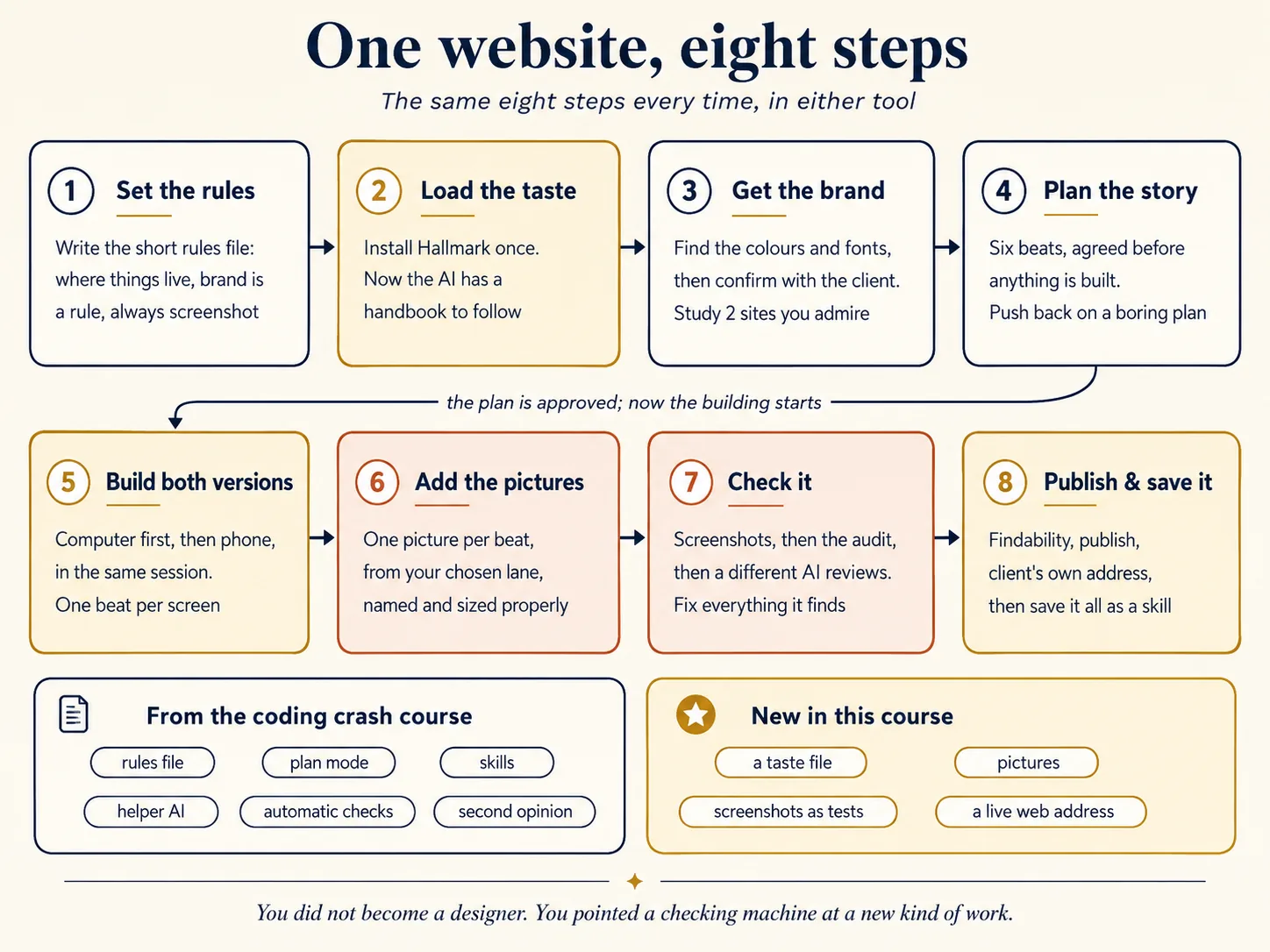
Step 1: Rules file for a web project
In Claude Code: run /init, then cut the generated file down to what the model cannot infer by looking:
# ayesha-practice-site

## Layout

- `site/`: the website source. Single HTML file with embedded CSS/JS until told otherwise.
- `assets/`: all media, named by story beat (e.g. `03-ledger-*`), optimized before use.
- `design.md`: brand constraints and design direction. Read before any design work.
- `docs/plans/story-spine.md`: the approved six-beat spine. The build implements this.

## Critical rules

- Brand constraints in design.md are a spec, not a mood. Never substitute colors or fonts.
- Every image ships with an alt attribute. No asset over 500KB.
- After significant changes, screenshot at 1440px and 390px and review both before reporting done.
- The story spine's beats may not be reordered or dropped without asking.
Why this matters: the screenshot rule means the AI checks its own work every time, instead of only when you remember to ask. The design.md rule means the brand colors are not something the AI can quietly improve on.
In OpenCode: identical content in AGENTS.md.
Step 2: Install the taste layer
In both tools, identically:
npx skills add Nutlope/hallmark
In Claude Code, also install Anthropic's frontend-design plugin through the plugin system. It then helps automatically on design work. Hallmark you call by name when you want the full treatment. The two work together.
If you are using Kimi K3, remember the warning from Concept 5: other companies' AI models are less reliable about picking up skills on their own. So say Hallmark's name at every design step rather than hoping.
Step 3: Extract the brand, study the direction
First Concept 7: point your AI at Ayesha's old site and ask for exact colors, fonts, and logo, with the line of code proving each one. It comes back with a deep green, a gold, and a serif font, each with its receipt.
Then make the phone call, which you never skip. Ayesha explains she is changing her brand: the green stays, the gold becomes a warmer amber, and she sends her new logo properly.
Then Concept 6: run Hallmark's study on two websites she admires. Counting her own brand, that is three references, which is exactly the number that forces you to combine rather than copy.
Everything goes into design.md, with her brand marked clearly as rules rather than suggestions.
Identical in both tools.
Step 4: Plan mode: spine to structure
Switch to plan mode, where the AI can look but not change anything (Shift+Tab twice in Claude Code, Tab in OpenCode). Describe the job: the six beats, the design.md, that phones matter most, and which moment is the bold one.
The AI comes back with a plan, and this is where you catch the mistake for free. Its first plan is a normal page: big picture at the top, then the beats squeezed in as ordinary sections. That is the boring default skeleton wearing your story as a costume.
So you push back:
The scroll is the story. One beat per screen. The balancing animation gets a whole screen to itself. No rows of feature boxes anywhere.
It updates the plan. Now you approve it, and save it to a file.
Step 5: Build with the design model
In Claude Code: this folder's settings point at Kimi K3 from Concept 4. Confirm with /status, not /model. Then leave plan mode and let it build, naming Hallmark as you go. Keep half an eye on your usage: K3 writes long, and this is the longest step in the build.
Build both versions in this one session. Computer version first to settle the design, then the phone version straight after, while the AI still holds every decision. Every beat restacks, and the balancing animation becomes the whole screen on a phone. Drag your browser narrow and wide to watch the switch, and record that for Ayesha.
In OpenCode: type /models, pick Kimi K3 through OpenRouter, and build. Same naming of Hallmark, same eye on usage.
Kimi K3 thinks hard, so this is slower and wordier than a Claude session. But what appears is noticeably not average. The accounting line draws itself as you scroll. There is not a single row of feature boxes anywhere.
Step 6: The media pass
Following the storyboard, a helper AI searches the free photo libraries for beats 1, 2, and 4, keeping to one kind of light and one mood. (A helper does this in a separate conversation, because forty photo thumbnails would clog your main one.) The two office photos taken on a phone go into assets/ for beat 5. Every file is named after its beat and kept under the size limit.
If a beat had needed a made-up picture, you would have made it on Lane 3 for a few cents, or on chatgpt.com for free.
And if Ayesha had said yes to the video, this is where you would make it. Find the shot by talking to Gemini Omni Flash. Lock the final version on Seedance at 720p for her to review. Then pay for full quality once she approves, in both the wide and the tall shape, at the price you already quoted.
Identical in both tools.
Step 7: Verify: screenshots, audit, cross-model review
The three checkers from Concept 11, in order.
The screenshot rule has been working quietly all along. Now run Hallmark's audit. The first run finds seven problems, including one thing that only works if you hover a mouse over it, which fails completely on a phone. Fix the list, run it again, until the list is empty.
Then Concept 12: give a different company's AI the brief, the design.md, and the screenshots. Here Claude reviews Kimi K3's work. It writes findings to a file and changes nothing.
The reviewer catches two things the builder could not see about itself: the photo in beat 4 has cooler light than the rest, and the amber button is hard to read against the green background.
The builder fixes both. You did not have to settle any disagreements this time, but you read everything, because the final judgment is still yours.
In Claude Code: the reviewer runs in a second worktree, as the coding crash course showed. In OpenCode: the reviewer is just a second connected provider in the same project.
Step 8: Publish, and save the process
The phone version was built back in Step 5, immediately after the computer version and in the same session, exactly as Concept 10 requires — which is why Step 7's checking covered both widths.
What remains here is publishing. The findability work happens now: the title, the description, the page list, and the sharing card. Test the card the honest way: paste the preview link into a WhatsApp chat and see what appears.
Then run vercel for a preview address, take the final pictures of the live page at both widths, and send Ayesha the link with three words: "open on phone."
After she approves: vercel --prod, connect her own .pk address from her own account, register the site with Google from her account, and hand over the package from Concept 14.
Finally, the move that compounds. Save the whole process as a skill file: the story template, the brand questions, the audit-then-review order, the publishing checklist.
Ayesha's cousin runs a textile export business. Your second website starts tomorrow, and it will take you half as long.
What just happened
Count what came from the coding crash course: the rules file, plan mode, skills, helper AI models, automatic checks, getting a second opinion, saving work for reuse.
Now count what was new here: a taste file, a way to get pictures, a screenshot used as a test, and a live web address as the finished product.
That ratio is the whole point. You did not become a designer. You pointed a checking machine at a new kind of work — and the machine, plus one file of good taste, did the rest.
And the differences between the two tools were tiny again: a different setup to reach Kimi K3, a different key to enter plan mode, a different place the reviewer runs. The thinking was identical.
The thinking is the real tool. The settings are decoration.
How to actually get good at this
Same rule as the coding crash course: reading this page does very little, and building does almost everything.
You will hit problems. That is normal, and it is how the learning happens. Every problem points back to a concept on this page:
| The problem you hit | What to fix |
|---|---|
| "Every site I make looks the same" | You have no taste file loaded, or you are not naming it (Concept 5) |
| "The AI ignored the brand colors" | No design.md, or the colors are not clearly marked as rules (Concept 7) |
| "It looks great on my laptop and broken on my phone" | You built one version and squeezed it. Film the story again (Concept 10) |
| "The page is pretty but nobody knows what to do on it" | No story, or two ideas fighting on one screen (Concept 8) |
| "I keep saying 'make it less generic' and nothing changes" | That instruction can never fail, so it changes nothing. Run the audit and fix the list instead (Concept 11) |
| "The picture bill surprised me" | You started making pictures before planning them (Concepts 9 and 15) |
| "My AI and I both missed an obvious mistake" | You need a different company's AI to look at it (Concept 12) |
| "Kimi K3 gets confused and expensive late in the day" | Nobody is tidying the conversation but you on that route (Concepts 4 and 15) |
| "The site is live but the button does nothing" | The last beat was never connected to anything (Concepts 8 and 11) |
| "It is beautiful on my laptop and too heavy for my visitors" | Set a size limit, add a still picture behind videos, load pictures late (Concept 11) |
| "My five pages feel like five different websites" | One design.md must govern them all (the multi-page section) |
One website per week beats eight concepts per day.
Pick something real. Your own CV as a page. A friend's shop. Your family business. Your school club. Run all eight steps, and write down what it cost you.
By the third website, the steps stop feeling like steps. They just feel like how you work. Skill here grows in stages. Knowing which stage you are on tells you what to practice next. Most people get stuck between stages 1 and 2. They publish pages that work, and collect clever things to type, instead of loading a taste file once and letting it do the work forever. If you climb one single stage from wherever you are today, this course has paid for itself.Where you are on the ladder — the eight stages of getting good at this (click to open)
Stage What it looks like Where it is taught 0. Mindset You understand that AI has design habits, that you check design by looking, and that taste can live in a file. The three ideas at the top of this course 1. First website online One real page, free pictures, live at an address someone else opened on their phone. Concepts 2, 9, 10, 13 2. Taste is loaded Hallmark installed. You have read a list of your own page's problems and fixed them all. Concepts 5 and 11 3. Story first, every time You never start building before the story is written and agreed, including the final action. Concept 8 4. The checking runs itself Every build has all three checkers working: screenshots, the audit, and the automatic rules. Concept 11 5. Building for other people You find and confirm a brand, get a second opinion, review on the client's phone, and price by the four boxes. Concepts 7, 12, 14 6. Your process is a file The whole process saved as a skill, and the second client really does take half the time. Concept 14 and Part 6, Step 8 7. Your process is a business Clients coming in, priced by the four boxes, multi-page sites from one design system, referrals arriving. Concepts 2 and 14, plus the multi-page section
Quick reference
The 15 concepts in one line each
- AI slop is maths, not laziness. Every AI has a favorite look, because it answers with the most common thing it learned. Even Anthropic wrote a file telling Claude to avoid its own habits.
- Four pieces build every site. Model, taste, media, host. Every decision fits in one box, and the boxes are also how you price a job.
- The best AI for design is not the best AI overall. They are different competitions. Check a blind comparison site, then send design work to whoever leads it.
- Any AI can run inside your tool. Change the address in Claude Code's settings, or pick from the list in OpenCode. Check with
/status, never/model. The best AI is a rented crown; your tool and your files are what you own. - Hallmark is taste in a file. Four commands (build, audit, redesign, study), 58 checks, and a different page shape each time. Free for anyone to use.
- Learn from sites, do not copy them.
studywrites down what makes a site work, intodesign.md. Use three references, because one reference tempts you to copy it. - Get the brand right first. Ask for exact colors and fonts with proof of where each came from, then confirm with the client's real files. Brand colors are rules, not suggestions.
- One story, one scroll. Write the story before building, one idea per screen, show the real thing at the top, be bold in exactly one place. And the last beat must actually work: a WhatsApp link, a form, or a small program. Never a dead button.
- Four ways to get pictures. Real photos (free), AI pictures free (quality by hand, or convenience automatically, never both), AI pictures for cents (both), and video for real money. Your story is the shot list.
- The phone is the main screen. Same story, filmed again for a tall shape. Decide on purpose where the layout changes.
- Three checkers make design testable. Screenshots give the AI eyes, the audit turns taste into a list, and automatic rules guarantee the basics: readable contrast, keyboard use, and a page light enough to load on mobile data.
- Get a second opinion from a different company's AI. An AI cannot see its own habits. Send the brief, the design file, and the screenshots. Findings go in a file.
- Publishing is two commands.
vercelmakes a preview to share,vercel --prodmakes it real. Then the client's own web address, and the findability basics: title, description, and the card that appears when the link is shared. Check the live page, not your computer. - Working with clients has six steps. Agree in writing, find and confirm the brand, sell the story before the pictures, review on their phone, price by the four boxes, and hand over the ability to look after it.
- Know what things cost. Price the pictures before you make them, keep conversations tidy, and learn what one whole project costs you.
Setup quick-ref (click to open)
| Want to... | Claude Code | OpenCode |
|---|---|---|
| Run Kimi K3 | Moonshot env block in .claude/settings.json, verify /status | /connect openrouter → /models → K3 |
| Install the taste layer | npx skills add Nutlope/hallmark, plus Anthropic's frontend-design plugin | npx skills add Nutlope/hallmark |
| Generate media in-session | Higgsfield CLI/MCP, or Lane 1–2 via fetch and APIs | Same |
| Screenshot the render | Ask it to set up Playwright screenshots | Same |
| Deploy | "Connect to Vercel via the CLI and deploy" | Same |
| Watch context on K3 | Set CLAUDE_CODE_AUTO_COMPACT_WINDOW to 1048576, then watch it yourself | Token readout in the TUI |
The build in one decision tree
New page or site?
    → Spine first (plan mode) → Hallmark default → media per beat → verify

Page exists but looks generated?
    → Hallmark audit → fix the list → if the skeleton itself is slop, redesign

Client has a brand?
    → Extract with quoted sources → confirm real assets → design.md as constraints

Admire a site?
    → Hallmark study → design.md as direction (never a clone)

Site outgrown one page?
    → A spine per page, one design.md for all → files as routes →
      framework with layouts only when repetition earns it

Before anyone sees it?
    → Screenshot both widths on the deployed URL → cross-family review → then the human
Flashcards Study Aid
Quiz: 42 Questions on the 15 Concepts
Test what you learned. Each session shows a fresh set of 15 questions.